Client
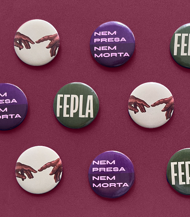
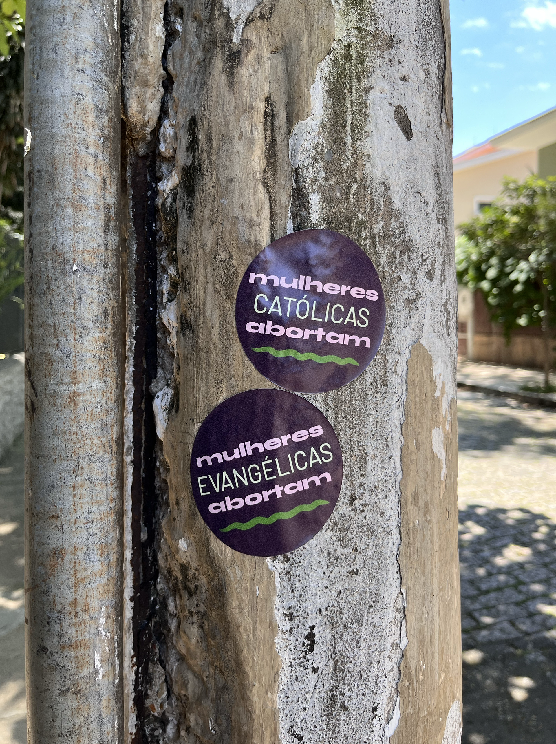
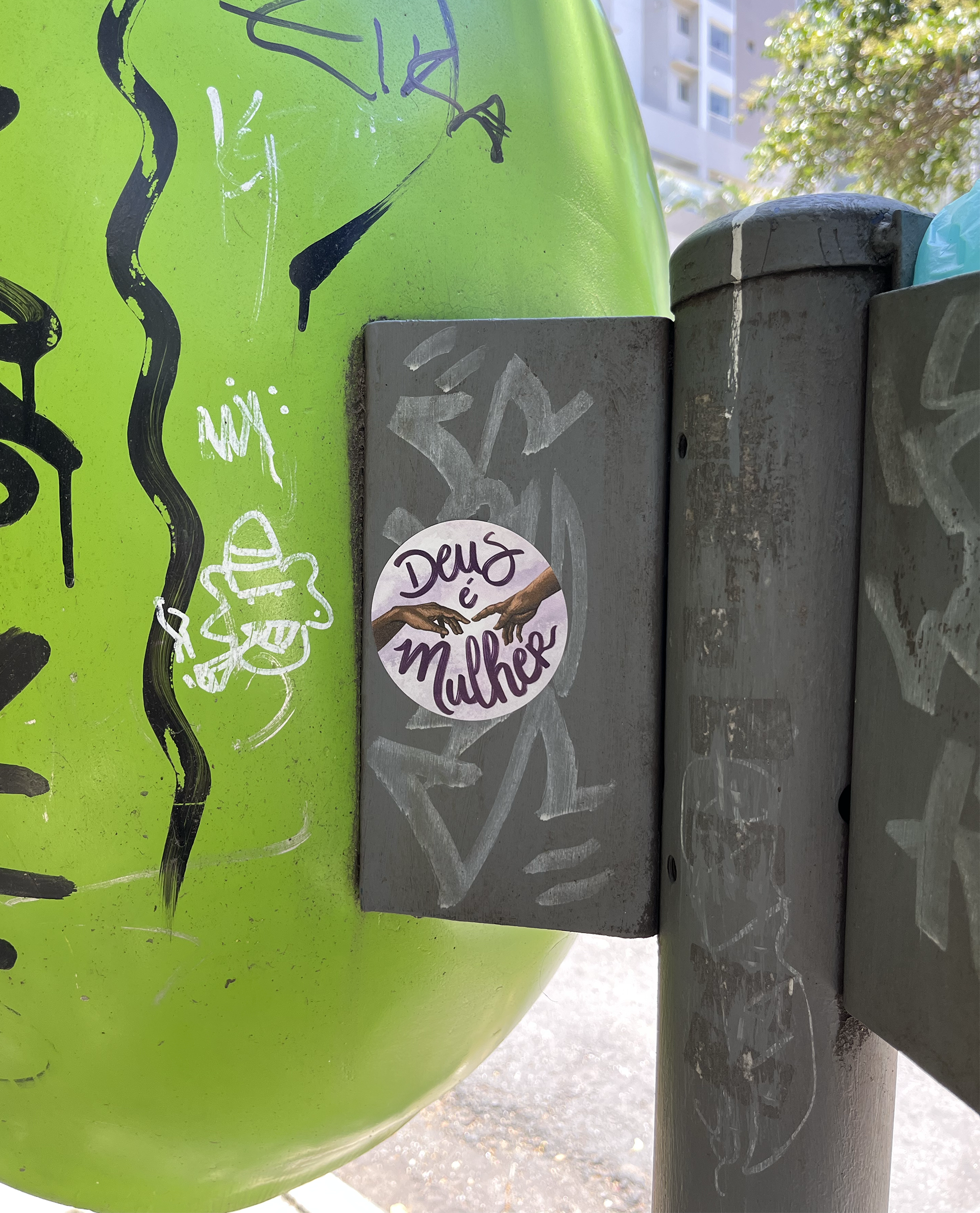
FEPLA, the acronym for Evangelical Front for the Legalization of Abortion, is a collective that seeks a popular and accessible dialogue on religion and sexual and reproductive rights.
Goals
A new, modern, and intelligent visual identity. Here, the balance is key: a design too fun could translate as insensible, too serious, and it becomes uncomfortably heavy.
Challenges
• A new logo that wasn't compromised by the group's name size
• Low resources for paid assets and the desire for a personalized look

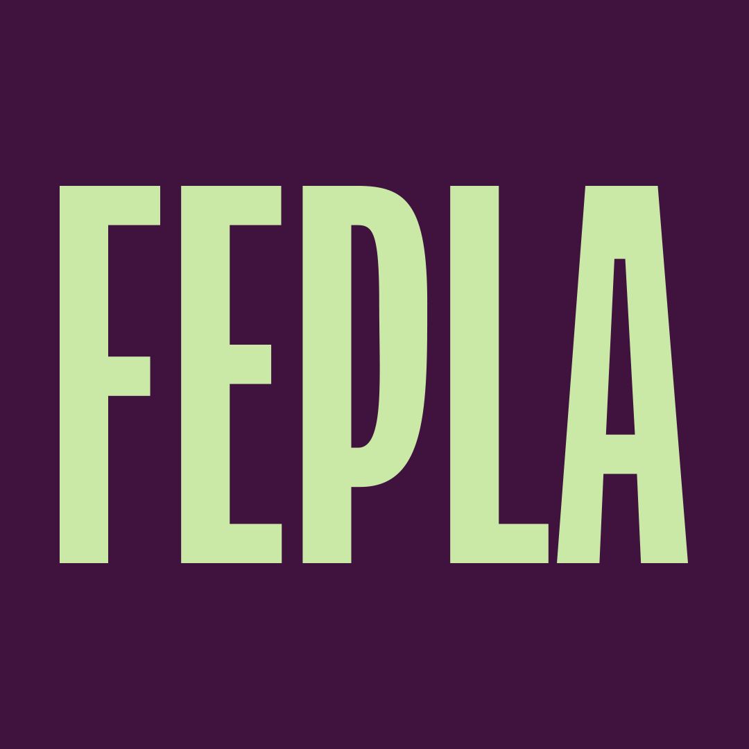
Logo Solution
FEPLA has a name that carries weight. Every word means something significant. The use of bolds and italics brings attention to the terms in a dynamic and interesting way.
Colors
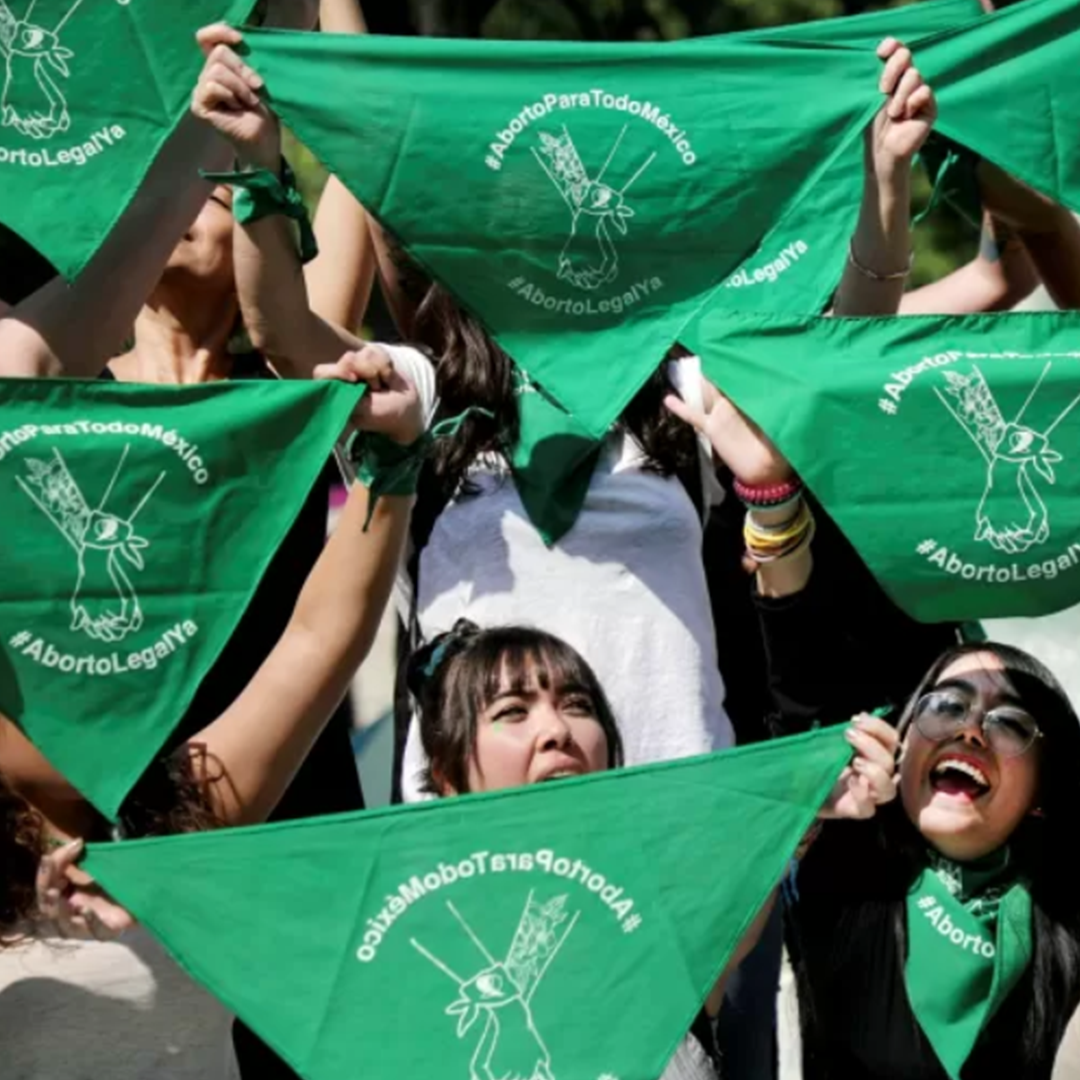
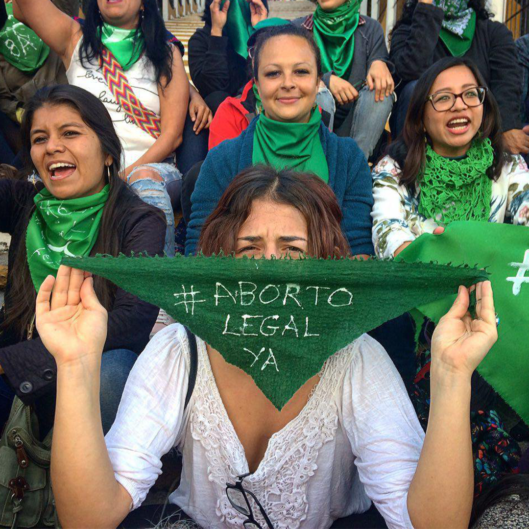
The palette is simple and talks about politics without using words: green is the primary color of the reproduction rights movement, purple is the primary color of the feminist movement, and red and pink are strongly related to the feminine world.
Images
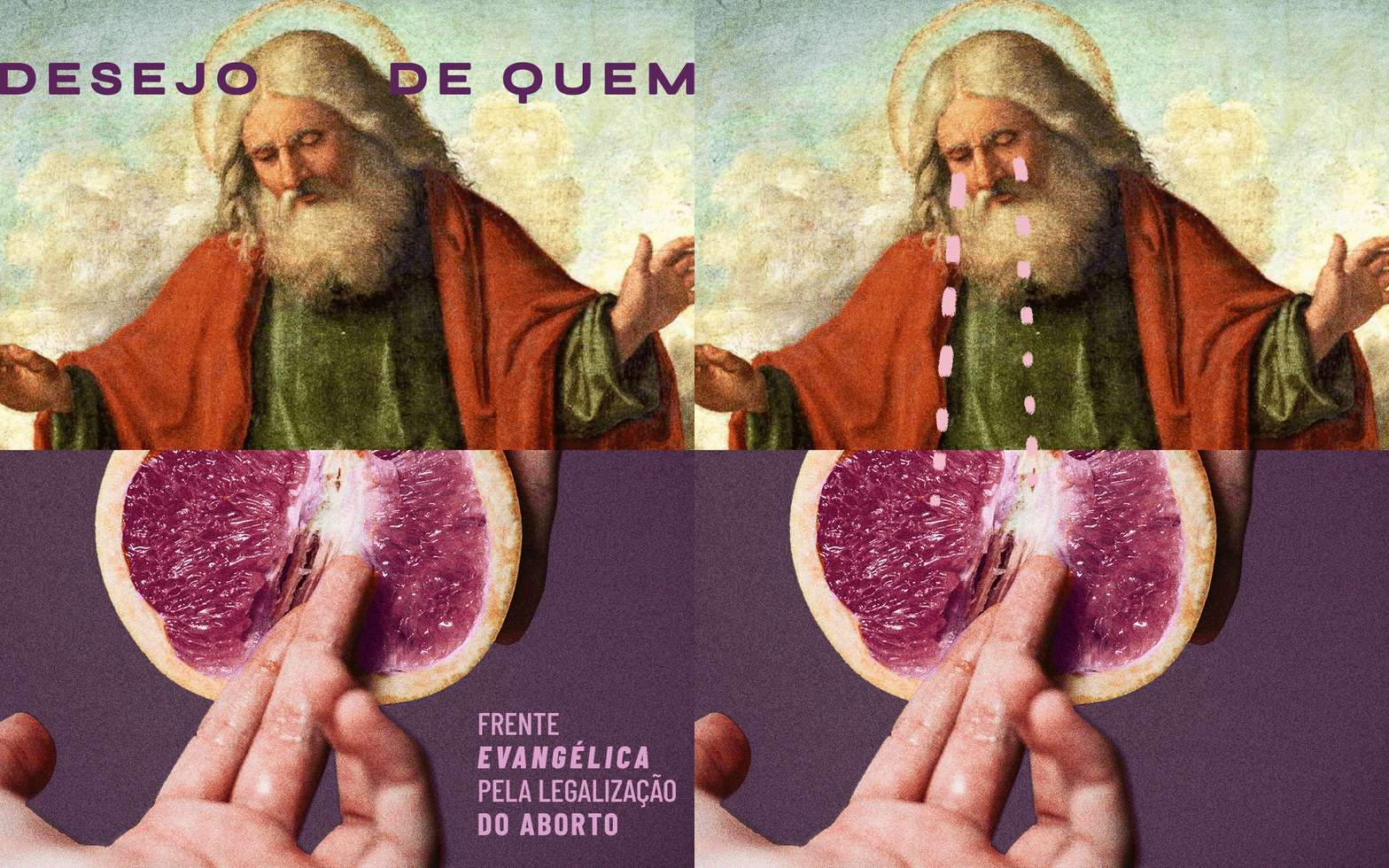
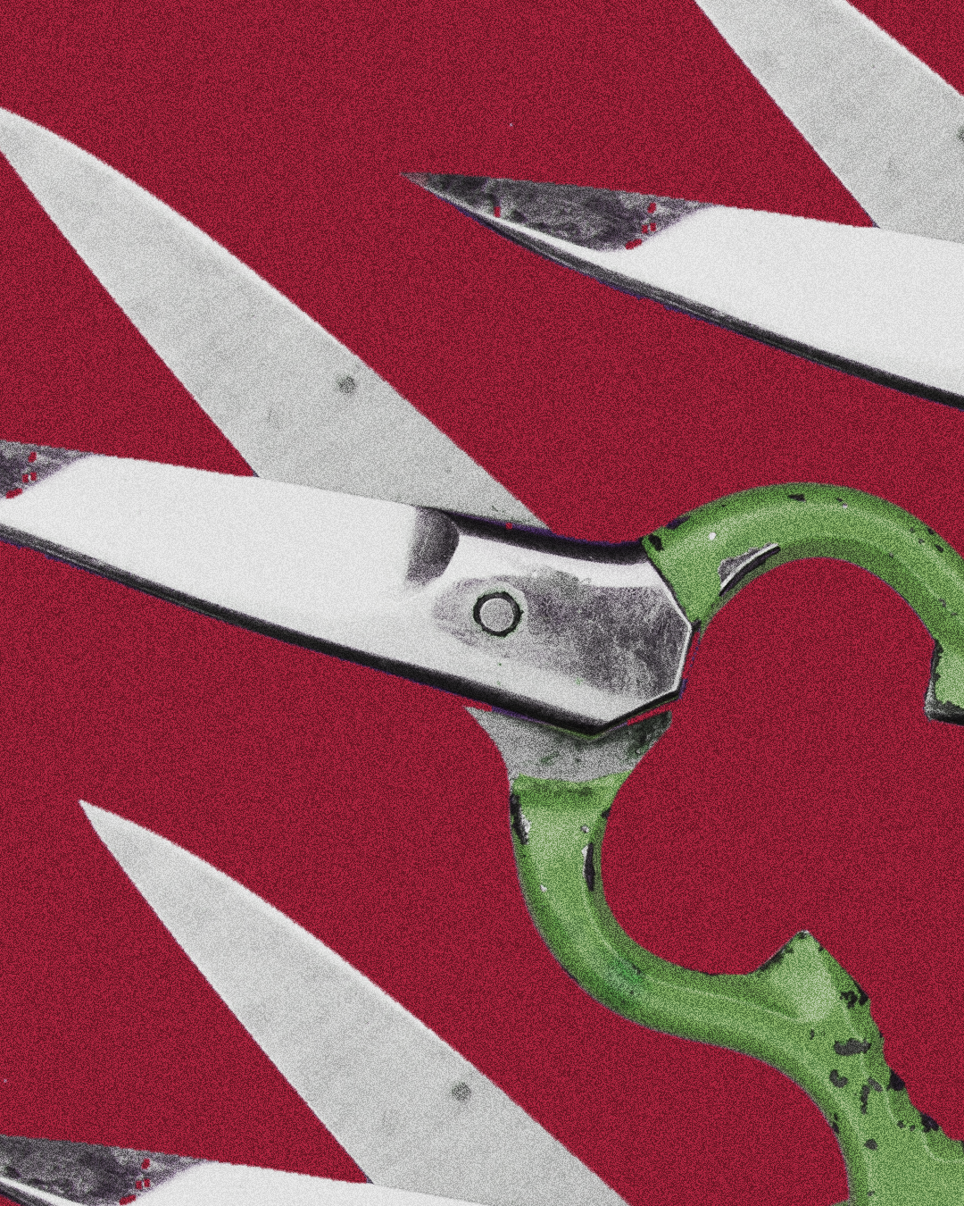
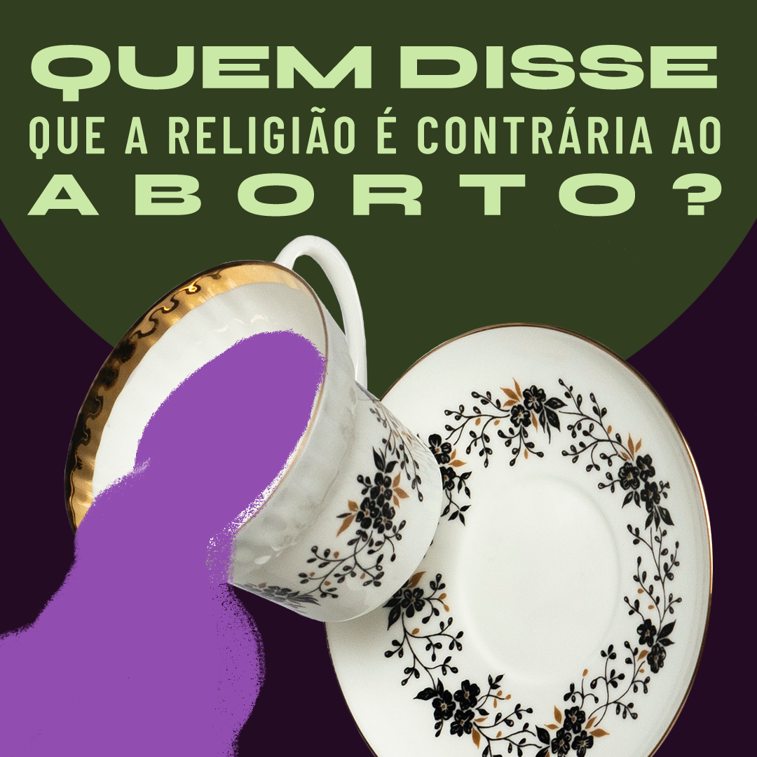
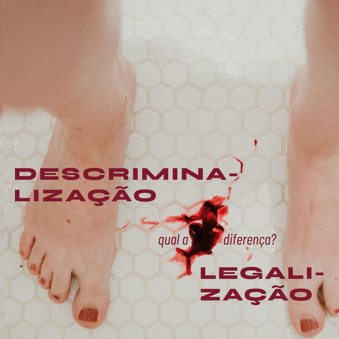
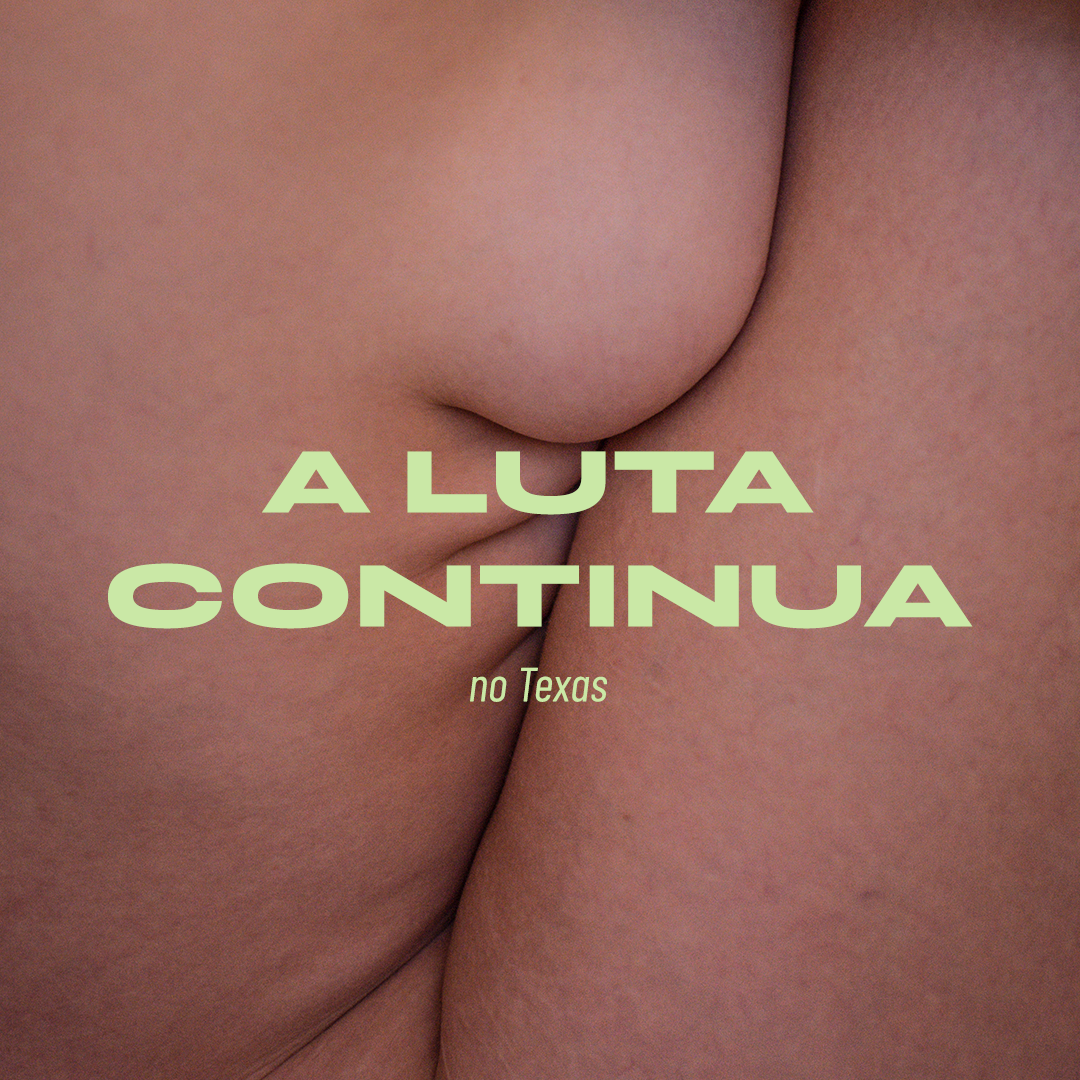
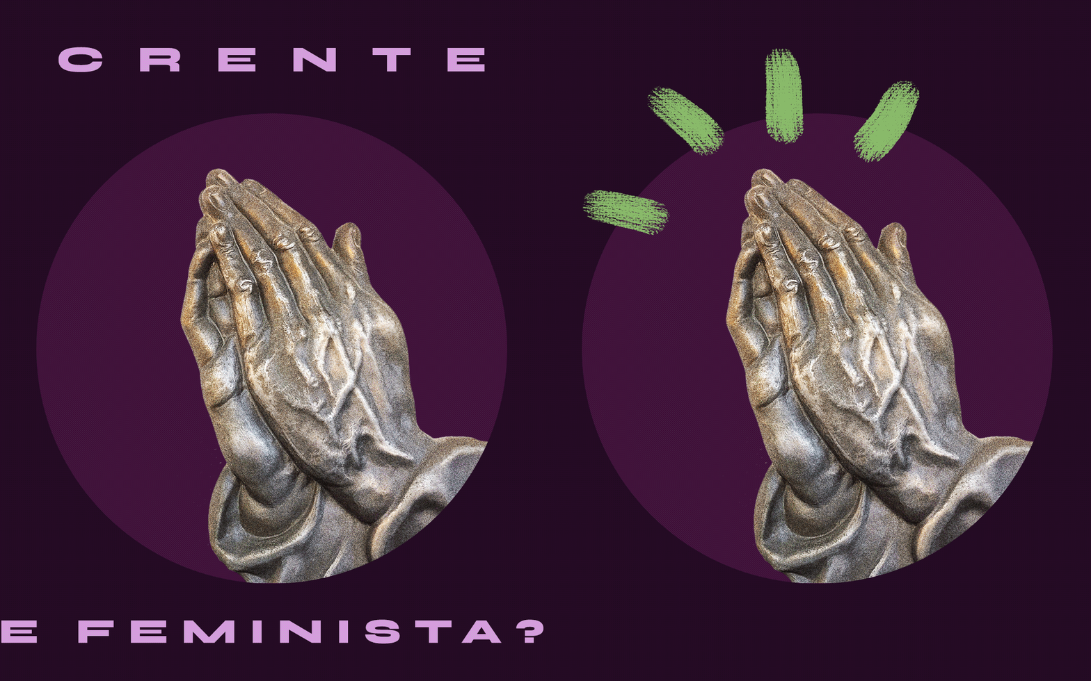
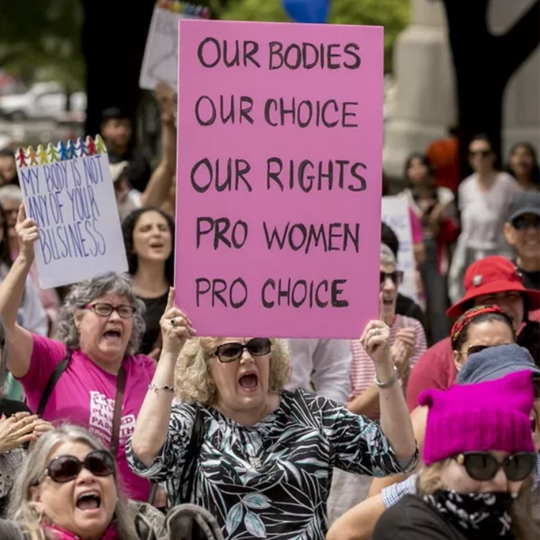
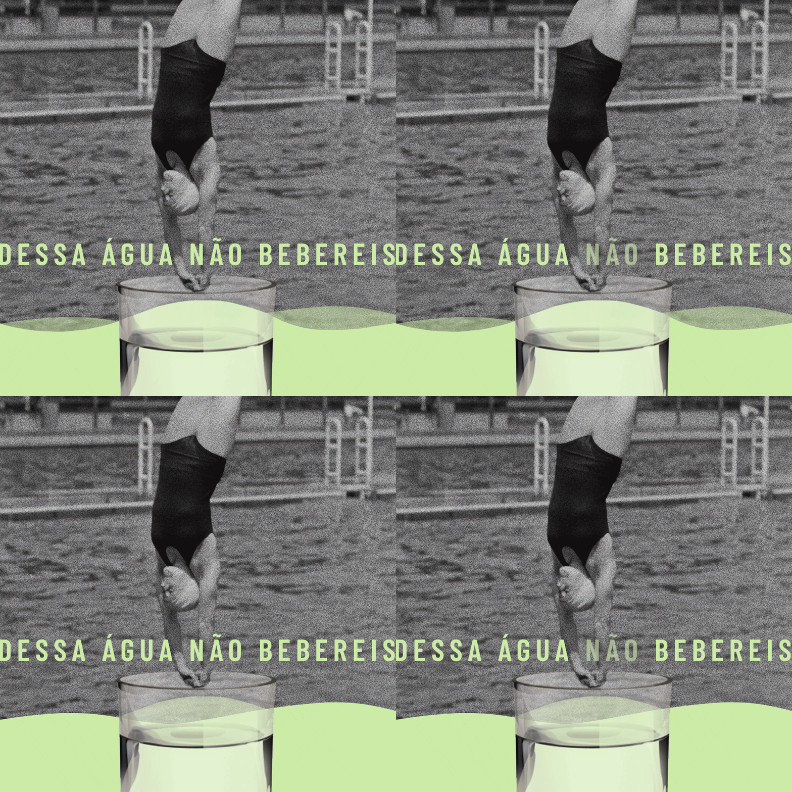
In this project, imagery plays a crucial role as they also talk about politics. For instance, is common for poor women to perform abortions using scissors, hangers or tea. Fruit and water are heavily connected with imagery from Christian beliefs. As a result, the imagery communicates well with the target audience since they understand it well.





Credits:
All the visual content on this page was created by me. This includes the concept, design, illustrations, collages, animations, and product photos.
Copywriting was done by Flora Barreto, Mônica Castro, and me.
Images are from Unsplash, Freepik, and Brazilian newspapers.